After a summer of quiet, we’ve seen a new version of Capture One 16.5, which brings two major features in addition to some minor improvements: AI people masking similar to Lightroom, and the ability to copy the look of a reference image to your photos. Let’s take a closer look.
AI people masks
When AI masks were added some time ago, I appreciated their simplicity combined with versatility — two buttons to select foreground or background, and for everything else, there’s an AI brush that selects pretty much any object or part of an object. But apparently that wasn’t enough for people photographers, and their feedback led to the addition of a new People button in the Layers & Masks tool. The button creates masks for different parts of people portraits according to the settings in the menu opened by the little arrow in the button:
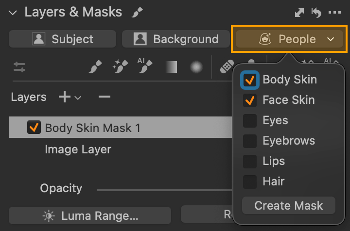
The names of each option speak for themselves and from top to bottom are used to create a mask of these parts of the subjects:
- Body Skin — skin everywhere except the face
- Face Skin
- Eyes — whites and irises
- Eyebrows
- Lips — lips
- Hair — hair
Each of these options actually selects only the specific part — so Face Skin won’t select the neck, for example, but will also skip the eyes and eyebrows, which have their own options. However, the individual parts can be combined freely, so you can easily combine, for example, Body Skin and Face Skin within a single mask, as shown in the images. Once you have selected the desired combination, just press the Create Mask button and wait for the result. The first use on a given photo may take a while as the content is analyzed, but if you want to add another layer with a different mask later (e.g. for lips or hair), it will happen almost instantly as the analysis will recognize all parts in one step.
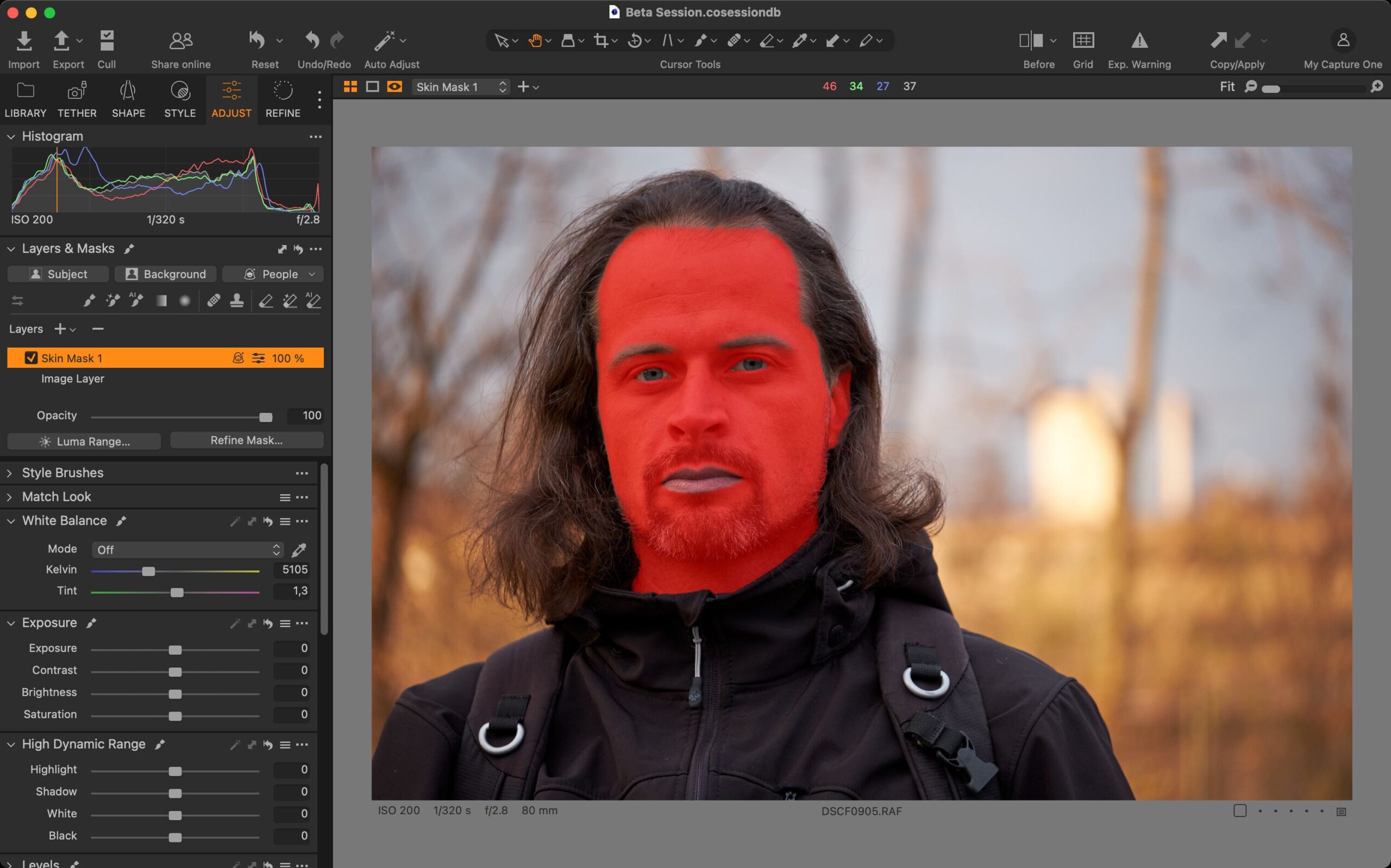
The quality of the selection is very solid in my tests, but of course it depends on the particular photo. For example, the accuracy of the hair selection depends on how complex the background is.
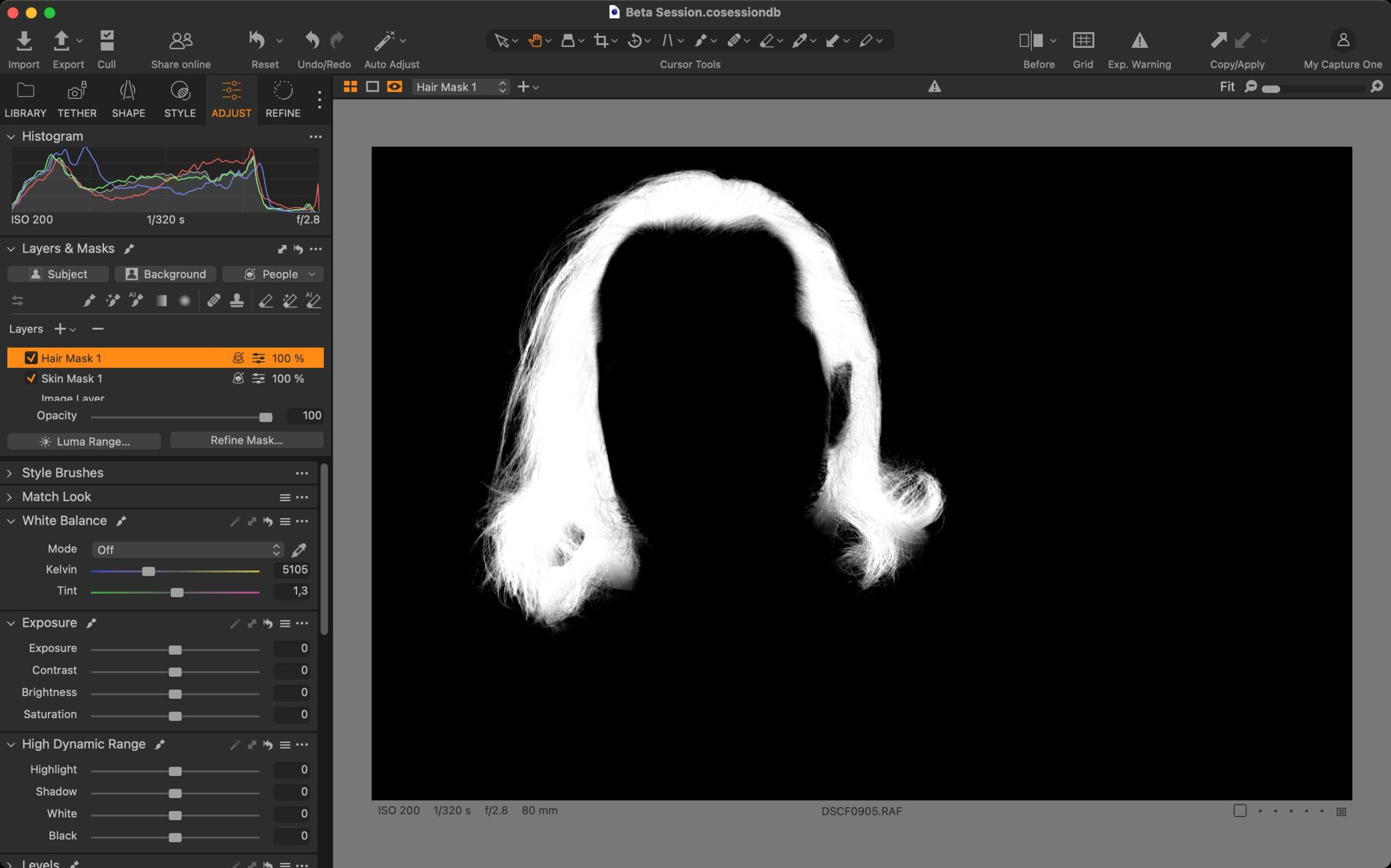
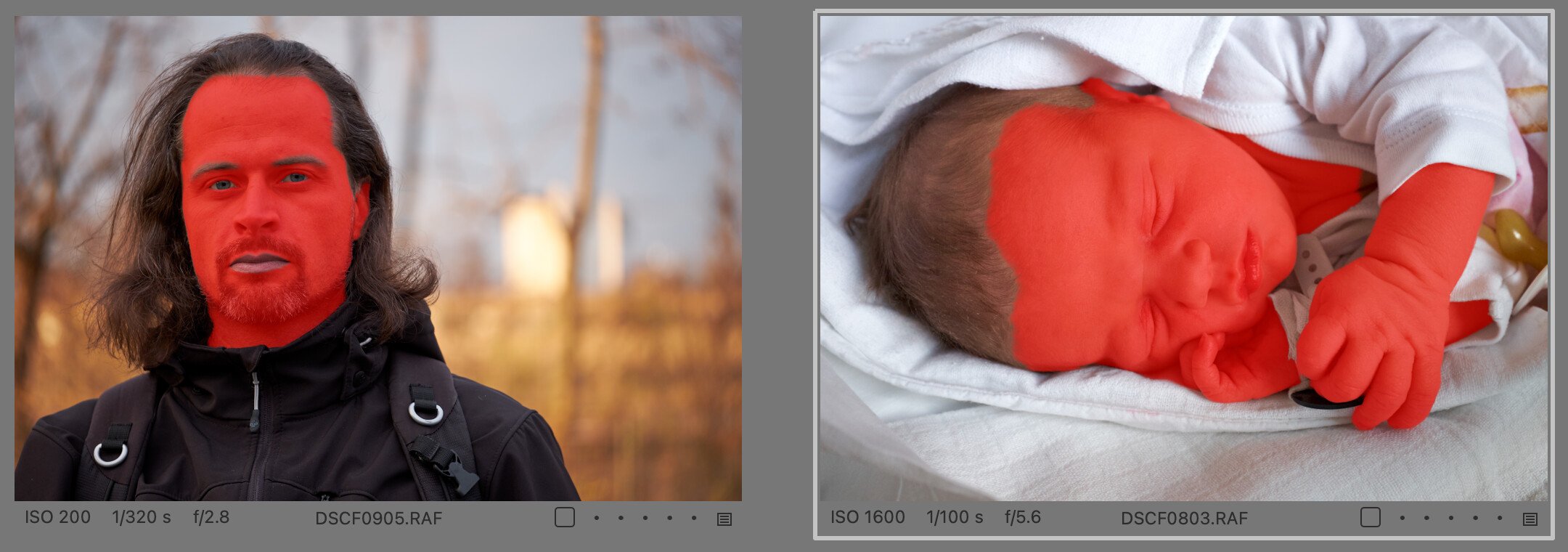
The AI selection should always recognize all the people in the photo (if you want to edit only one face, for example, simply erase the others from the mask with a regular eraser). If you copy the layers created with this tool to another photo or save them to a style, the parts on the target image will be detected and a corresponding mask will be created (as with the Subject and Background selections).
Match Look — copying the look of a reference photo
While AI masks for photos of people are basically perfect, I feel differently about the Match Look feature. First, let’s talk about what it is. It’s a fairly complex tool internally, but with a very simple interface, whose job is to take the look of any photo we submit to it as a reference and make a similar adjustment to your photo (or photos). This, of course, theoretically offers a wealth of possibilities, such as
- Speed up the processing of large sets of photos.
- Easily maintain a consistent look across multiple photos.
- Improve style features — references can now be part of the style, so it should be smart and adapt to pretty much any photo.
- Making it easier to create styles — an existing reference will automatically create adjustments without you having to manually change individual sliders, even if the target photo isn’t ideal (e.g., it’s underexposed, etc.).
- And, somewhat controversially, this tool could allow you to “steal” the refined styles of photographers past and present — at best as a tool to learn and improve your skills, at worst as an effortless and blatant copy of a proven look.
So this is a theory. But I have to say that the practice so far is a bit different — or at least varied. I have to admit that when I saw the official introduction video of the feature, I was impressed by how convincingly it worked. However, after testing the beta (and now the final release), I’m much more sober about it, and it seems that the photos selected for the webinar were chosen so that Match Look worked best with them. Again, since the feature is AI-based, it probably depends a lot on what image data it was trained on, and thus the result will affect whether or not your photos match the model. Personally, I tried a number of photos as references, from my own to those freely available on Unsplash to licensed works by Ansel Adams, for example, and I have to say that the results were not as clear-cut as one would hope.
Overall, Match Look does a good job of matching distinctive styles, such as high-contrast black-and-white or color-toned photos. More subtle adjustments, on the other hand, are a bit lost in my opinion, and in some cases the result was completely wrong.
However, I do not want to be too negative, because it seems to me that in many cases the function will work very well. My opinion, based on initial testing, is that this tool will probably work for you if you are processing a series of different photos of a similar subject. For example, it seems to be able to handle outdoor portrait sessions (studio sessions too, of course, but simple copy editing is usually enough for those), and I imagine it can handle a wedding, or at least its blocks like ceremony, party, etc. But for landscapes or wildlife, the results seem to me to be rather mixed. I’ll show some examples later in this article. Anyway, I’m not dismissing this feature, and I expect it to get more improvements in the future.
But let’s see how to use it. The Match Look tool has taken the place of Smart Adjustments in the Adjust tab of the Tools sidebar. This makes sense, since Match Look is essentially its more powerful successor, designed to perform similar tasks (however, since Smart Adjustments is designed to work on photos of people, or rather faces, it hasn’t disappeared from Capture One, and you can return it to the panel).
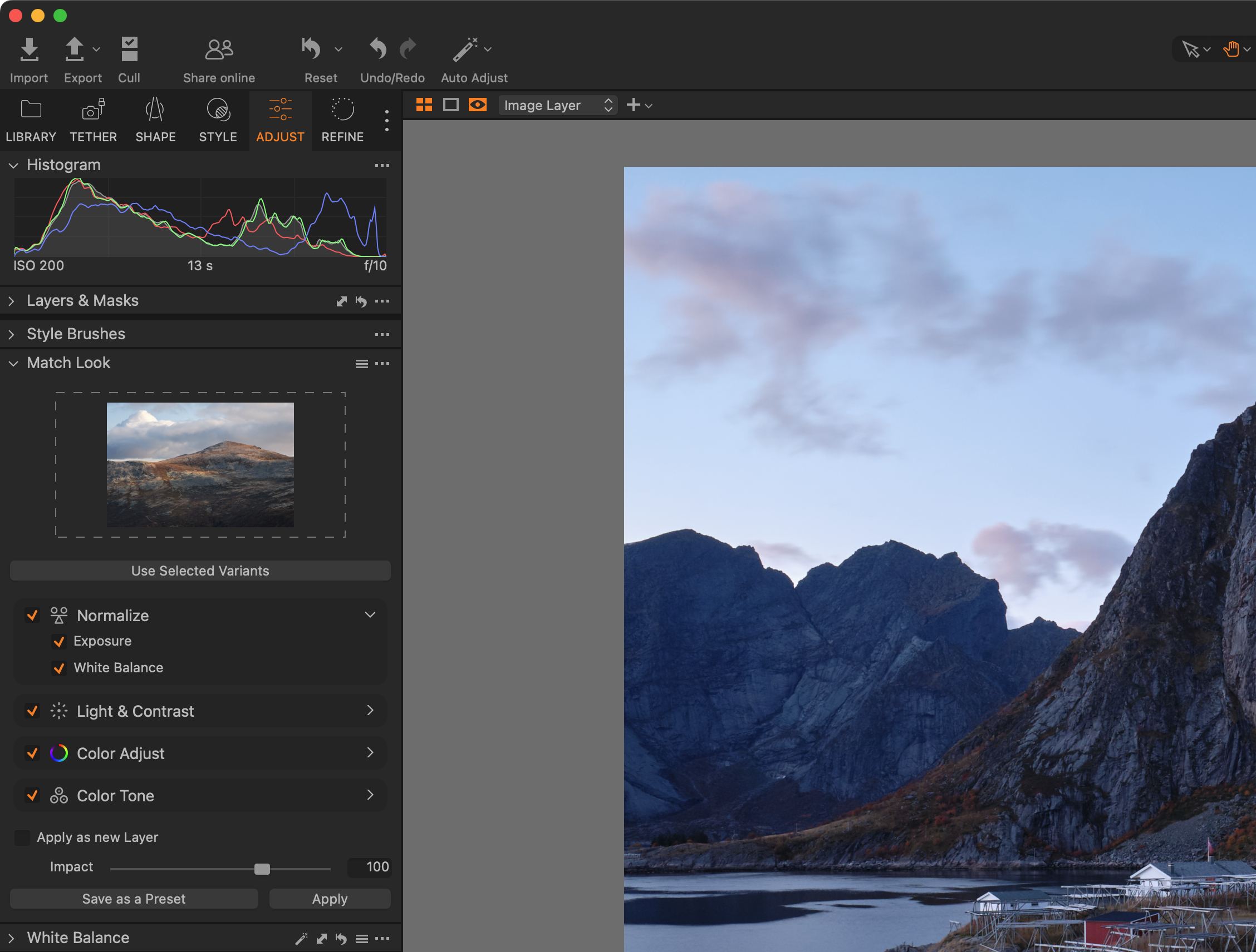
The upper part of the Match Look tool is used to specify the reference photo. This can be either your photo from the catalog or session, or any JPEG photo from your hard drive or the web. You can either drag the reference photo here with your mouse (directly from the catalog or from anywhere on your computer), or use the photo currently displayed in Capture One with the Use Selected Variants button. The plural in the word variants is correct because Capture One allows you to use multiple photos as a reference at once (both from the catalog and as drag-and-drop files). In this case, there is a kind of averaging between them, and the edit tries to look like it fits between all of them.
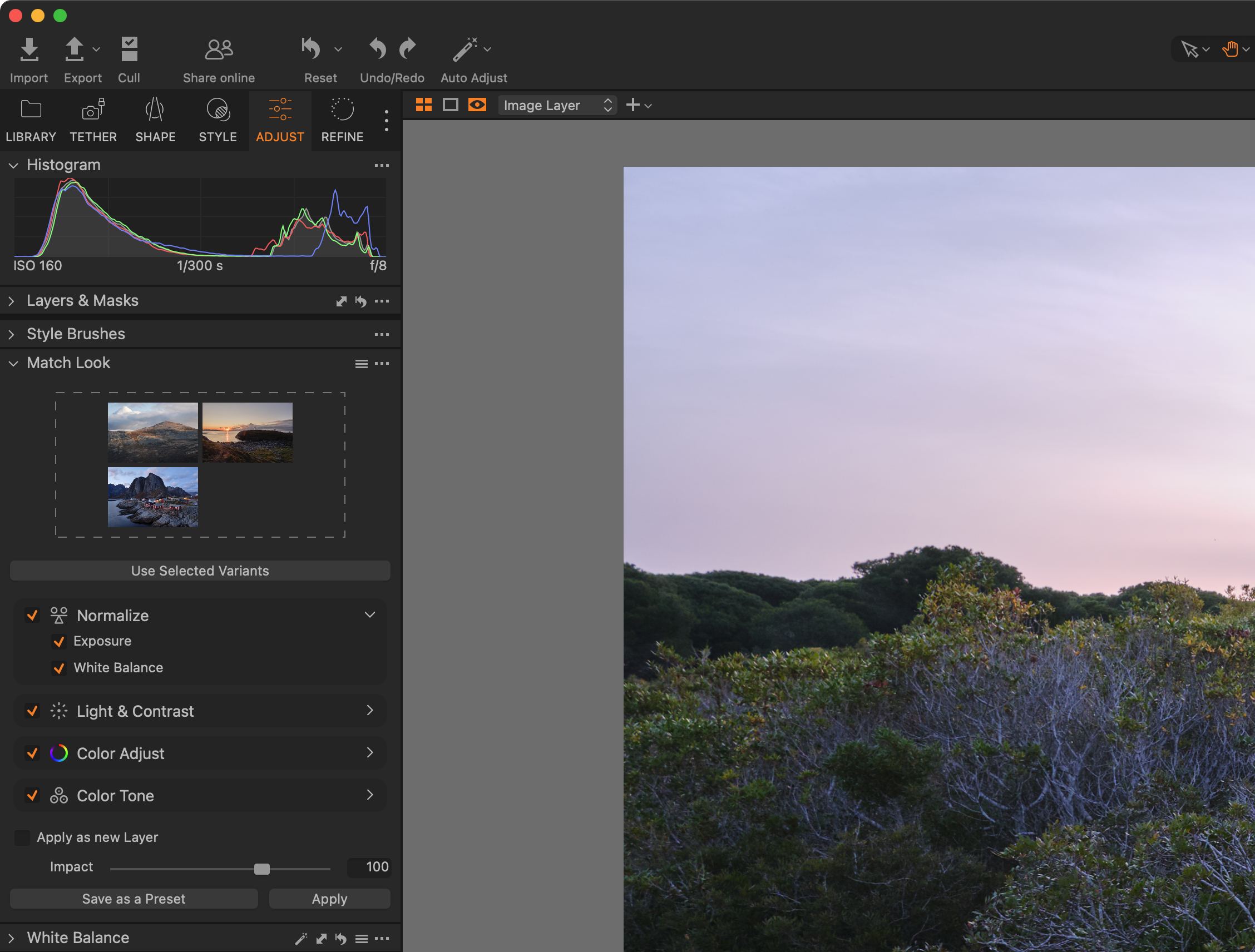
In the next section, there are four groups where you can use checkboxes to specify the tools you want to use when applying the look to the target image.
- The Normalize section includes
- The Exposure slider of the Exposure tool
- The White Balance tool
- In the Light & Contrast group, you can enable or disable the use of
- The Contrast and Brightness sliders of the Exposure tool
- The Highlights and Shadows sliders of the High Dynamic Range tool (HDR Highlights and Shadows option)
- The Whites and Blacks sliders of the same tool (HDR Whites and Blacks option)
- Levels
- and Curve in Luma mode
- In the Color Adjust group these are
- The Saturation slider of the Exposure tool
- Color Editor in Basic mode
- Conversion to black and white with the Black & White tool (B&W option)
- And finally, in the Color Tone group
- The Master tab of the Color Balance tool
- The Shadows, Midtones, and Highlights tabs of the same tool by selecting Color Balance (S, M, H)
- and the R, G, and B channel curves of the Curve tool (Color Channel Curves option)
The Impact slider at the bottom determines the intensity of the applied adjustment — a value of 100 means that the photo should more or less match the reference photo, higher values increase the effect, lower values reduce it. It’s important to note that Impact has no effect on the tools in the Normalize group, which means that exposure and white balance adjustments will always be made at full intensity. If you don’t like it, you’ll have to turn it off completely, adjust the sliders later, or apply the entire Match Look adjustment on a separate layer.
To do this, use the Apply as new Layer option, which will create a new layer with a mask over the entire photo and all the necessary adjustments. You can then reduce their effect by using the layer’s Opacity — this, of course, also reduces the effect of the tools in the Normalize group. Note that Capture One doesn’t allow you to use the Black & White tool on the layer, so conversion to black and white is always done as a global adjustment and is not affected by the layer’s opacity.
Once you have everything set up to your liking, all you need to do is select the destination photos and apply the adjustments to them using the Apply button. All of the tools listed above (unless you’ve turned them off in Match Look) will actually be used to achieve the final look. Capture One will do its best to match the style of the reference image, but if the result isn’t perfect, you’ll see exactly which sliders were used and at what values — just as if you had tried to make the adjustment manually. So it’s easy to intervene and tweak the result. Of course, this also means that Capture One can’t redo the entire photo from scratch — it’s not generative AI that will, for example, swap out the sky for a different one to make the photo more closely resemble the chosen reference.
I have taken this into account in my testing, of course. So let’s go through some examples of using this feature — some better, some worse. The version of the photo with the adjustment made by Match Look is always marked with a gray border, and unless otherwise noted, you’ll find the original photo on the top left and the reference photo on the bottom left:
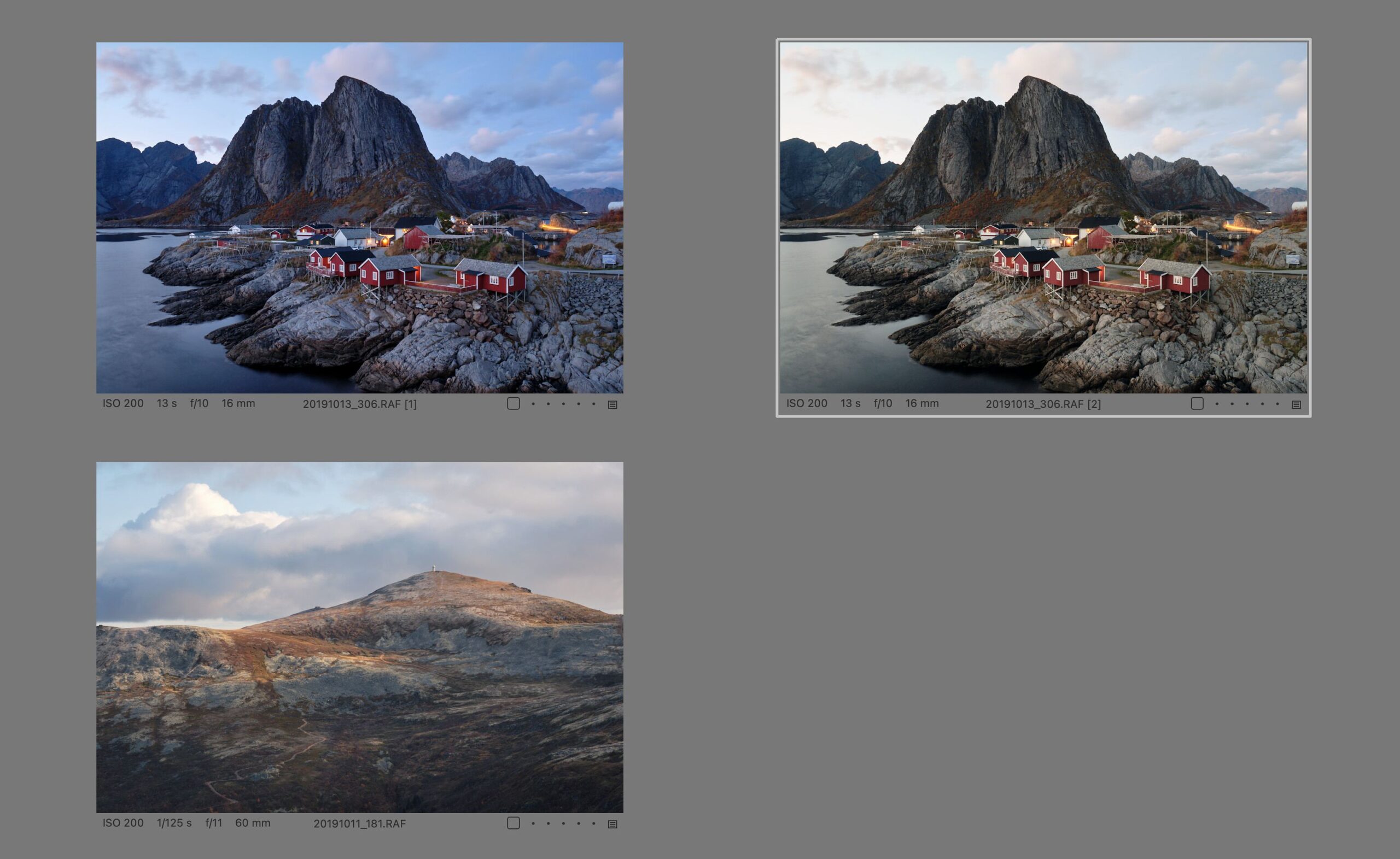
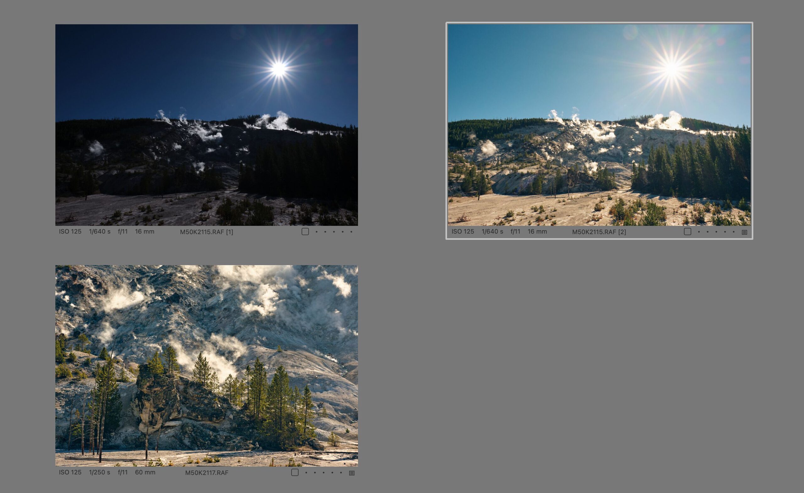
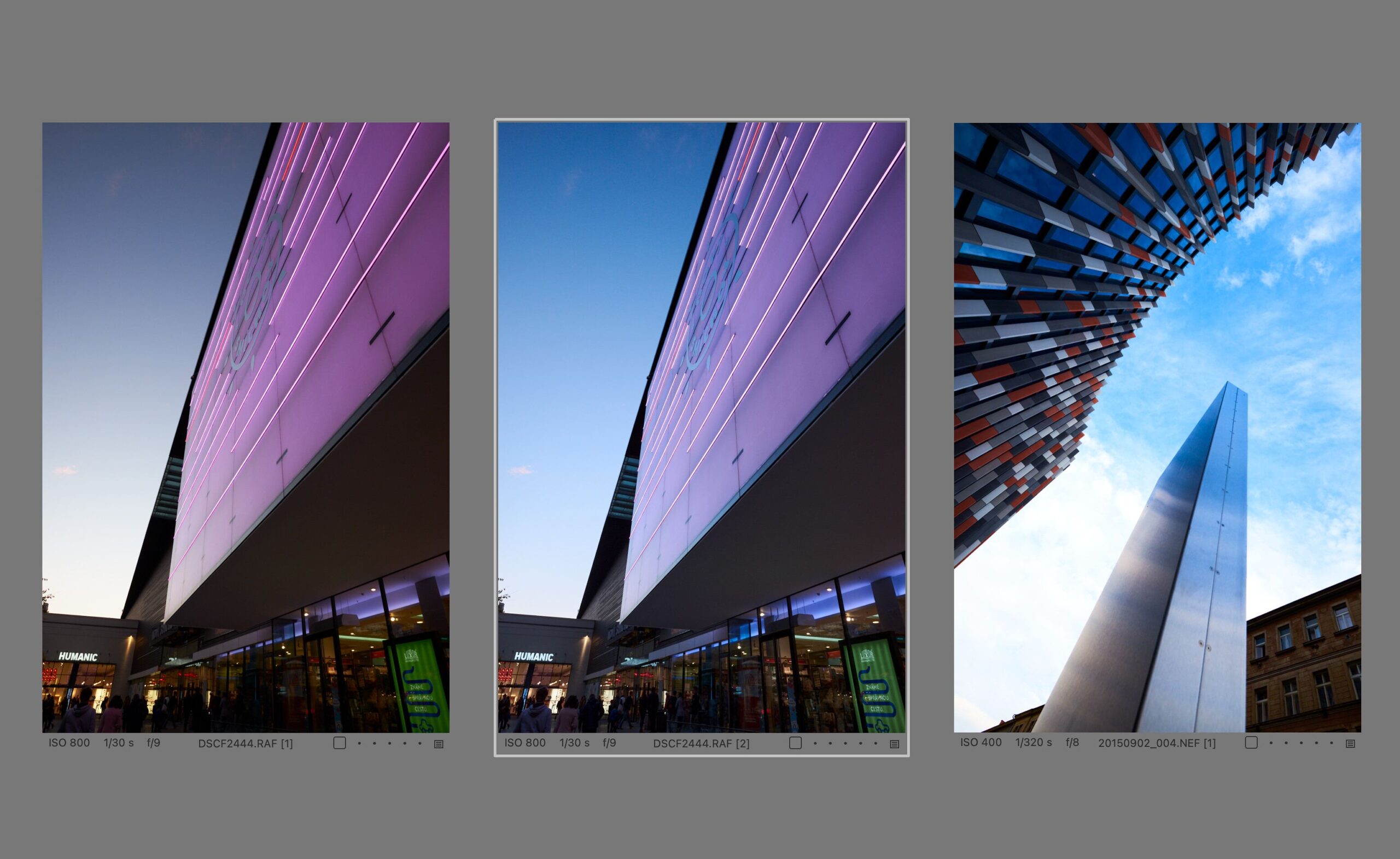
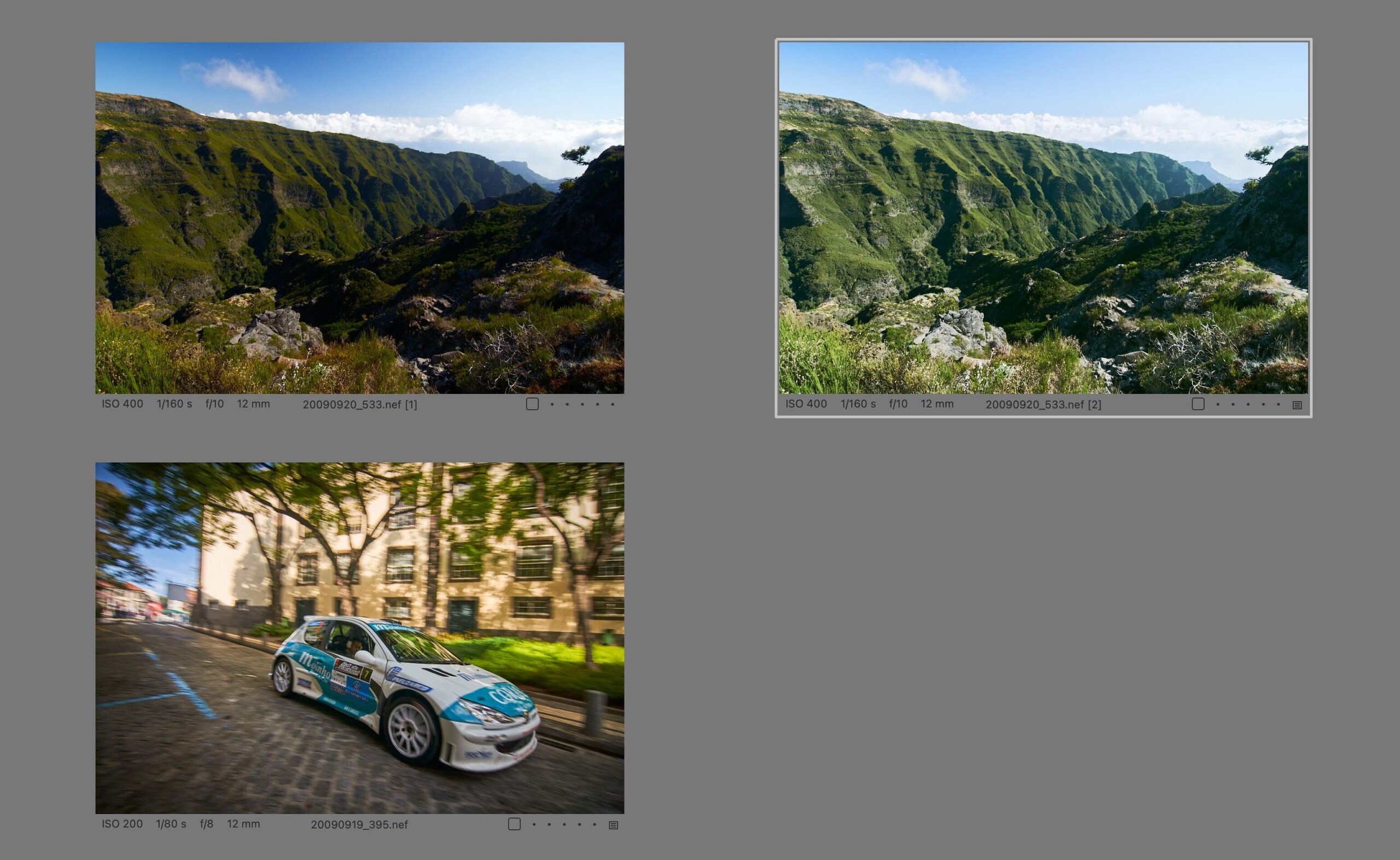
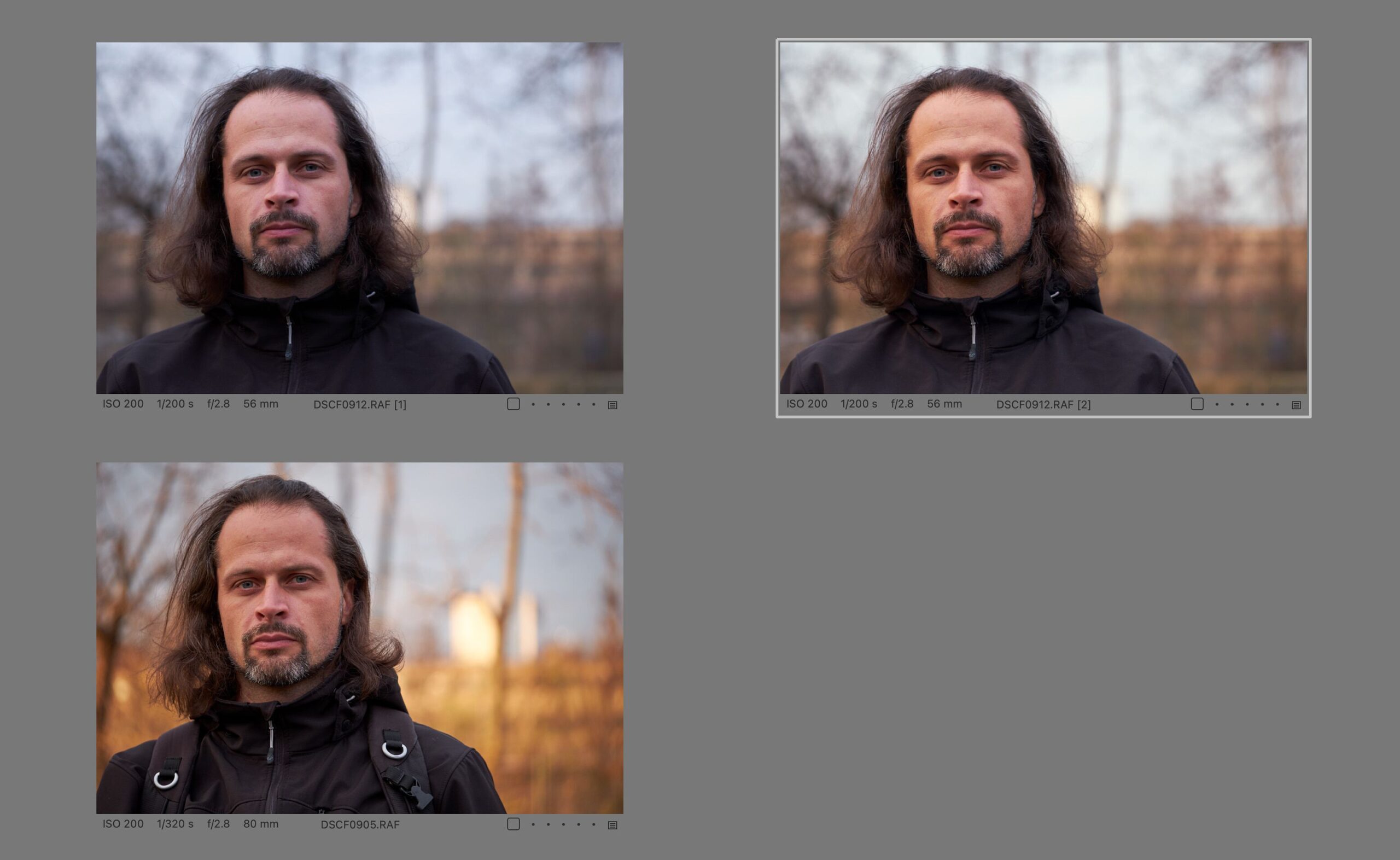
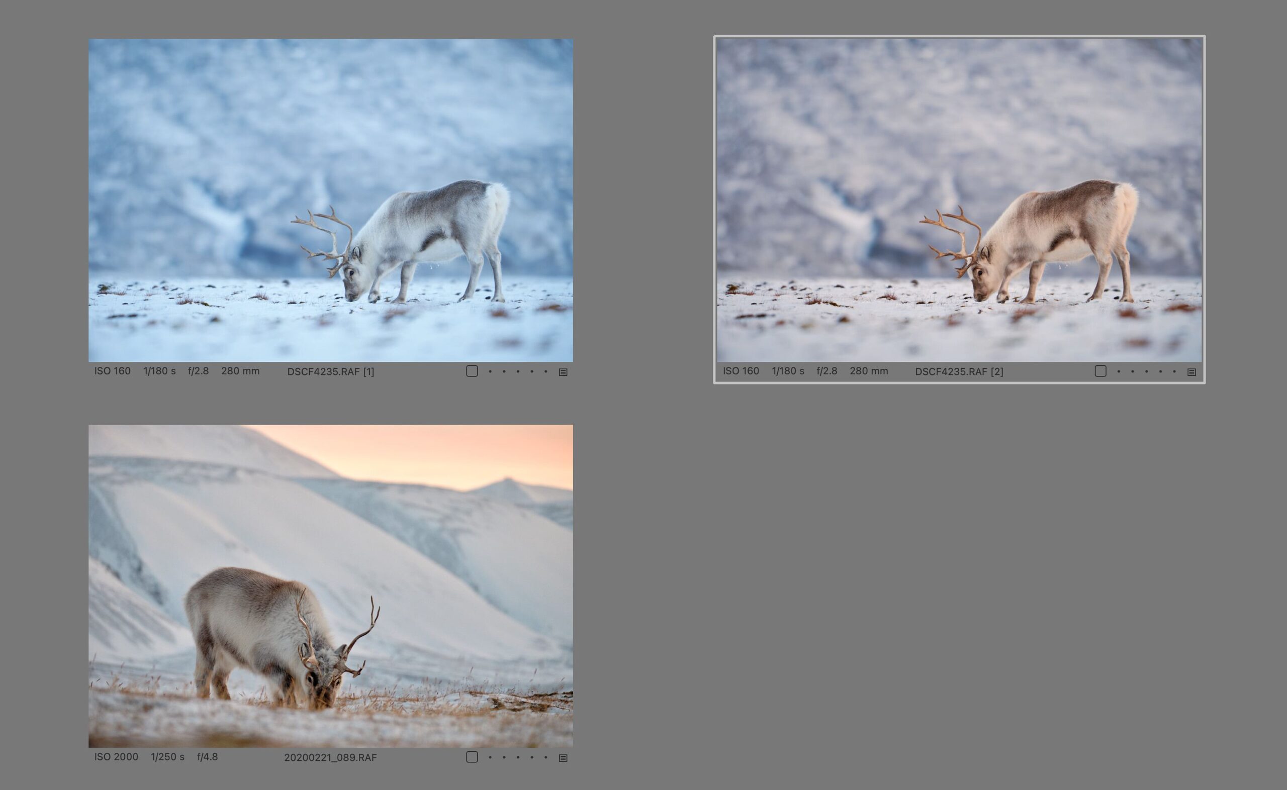
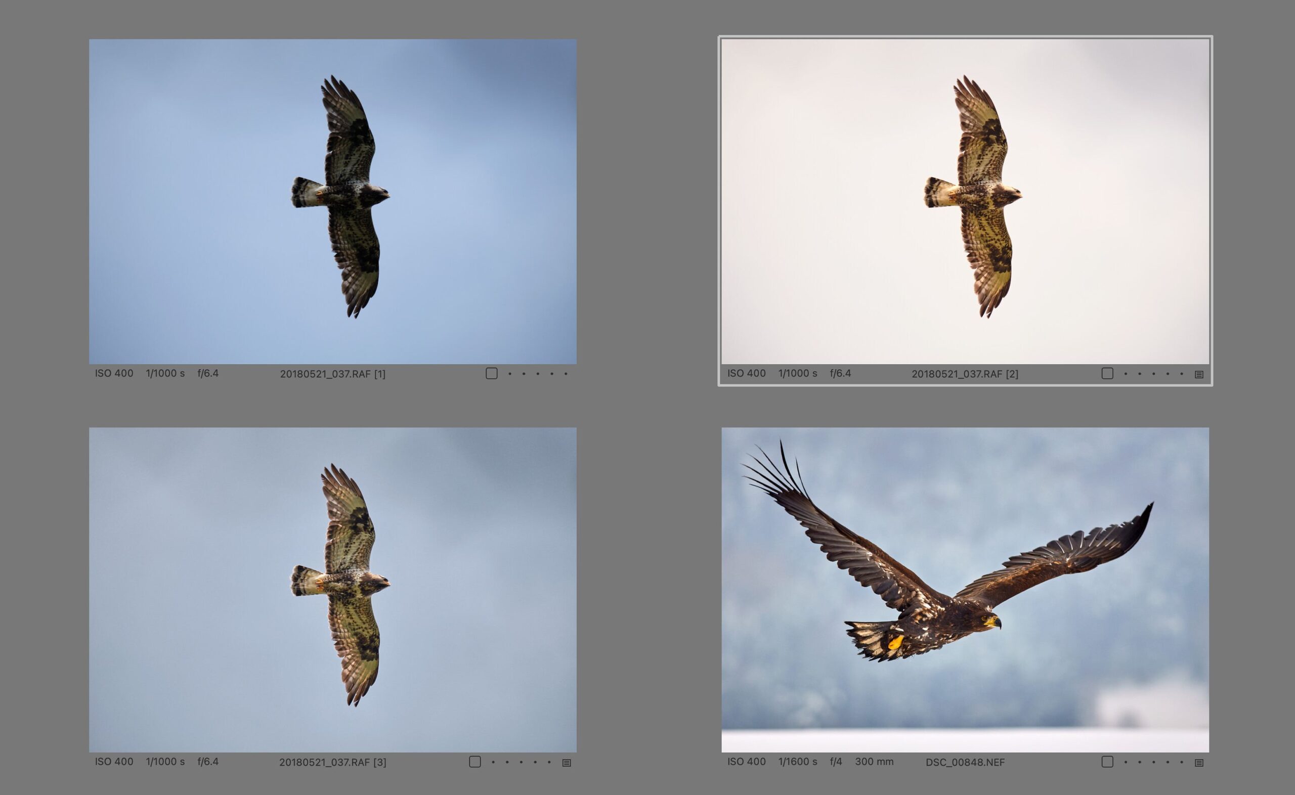
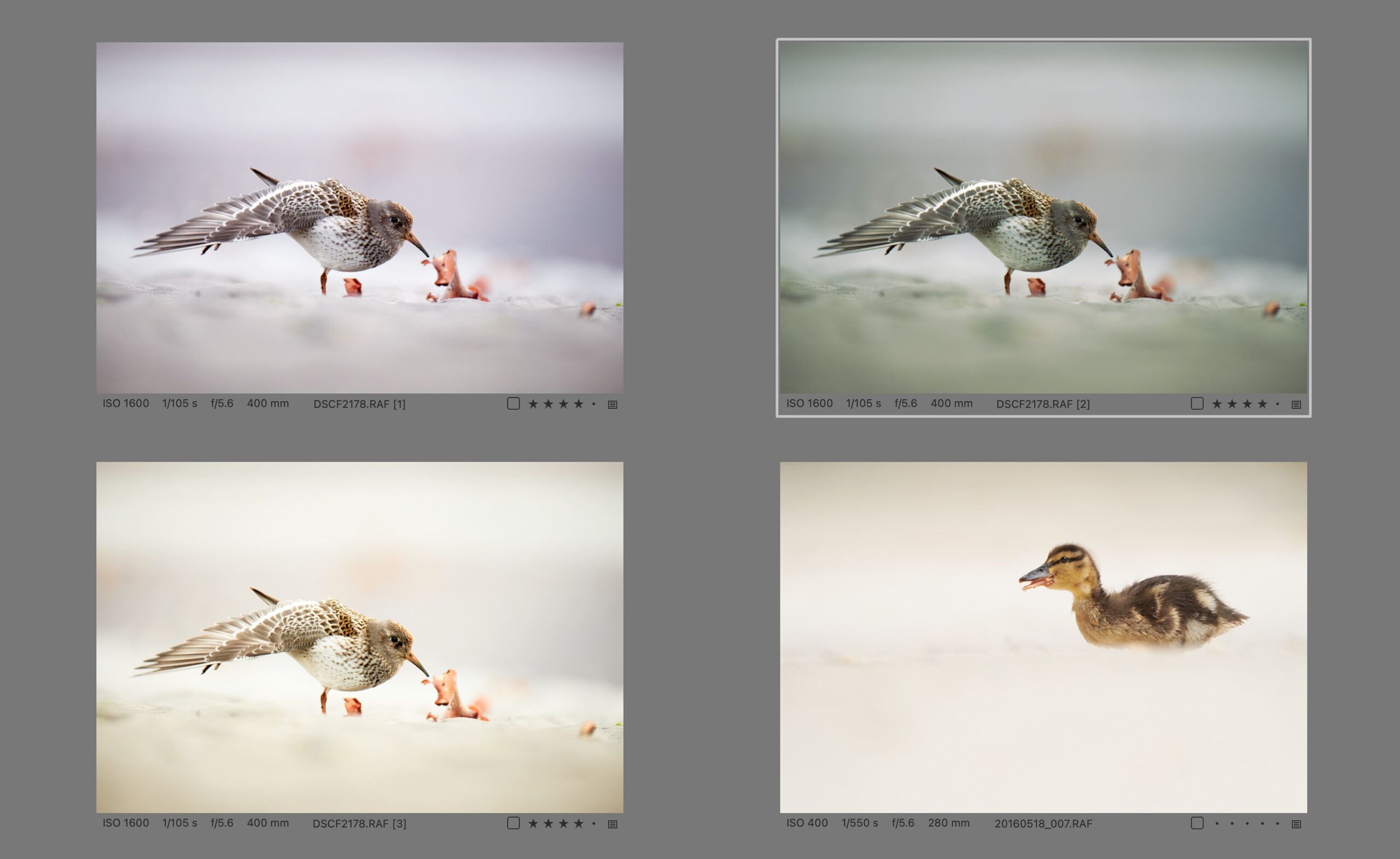
As you can see, the behavior of Match Look is sometimes a bit unpredictable. It’s quite possible that it will work perfectly for your particular genre and style and become the most important new feature for you. It may also become an occasional tool to be used from time to time, which will probably be the case for me for now.
Other news
I can’t say that I’m happy with how the recent additional news adds more confusion to what each version of Capture One offers. In fact, most of them are only included in the Studio and All In One subscriptions. The latter was previously just the regular Capture One Pro, but with both desktop and mobile applications included, along with a cloud-based Live service for communicating with customers. Starting with this release, the All In One subscription also gets some feature enhancements over the regular Pro version, which — as you’ll see — is not always entirely logical anymore, and I personally see it more as an attempt to move more users to a more expensive subscription, even if it’s not some indispensable features for now.
Cloud Settings is a new feature that allows you to use Capture One’s cloud to synchronize shortcuts, export presets, workspace and styles across a single user’s devices. I find the inclusion only in the Studio and All in One subscriptions contradictory — on the one hand, both more expensive subscriptions are more likely to be used on multiple devices, on the other hand, even the regular Pro version offers a license for more than one computer, so there’s no logical reason why its users wouldn’t want to synchronize these settings.
Replace Background is also included in the Studio and All In One subscriptions. I don’t see any logical motivation for including it in the All In One version. Fortunately, it is not nearly as revolutionary a feature as it may seem. Technically, it’s just the integration of an external paid Photoroom service to do the background replacement and return JPEGs to the catalog. Nothing that couldn’t be handled outside of the Capture One, or it would be relatively easy to create a plug-in for that purpose.
The third new feature included in both higher subscriptions is the integration of Content Credentials which is a standard for some kind of digital confirmation or record of what happened to a photo when it was edited in Capture One, i.e. how it was edited. It seems that Content Credentials could be an important technology for photo credibility and transparency in the future, and is already directly supported by some cameras. If it really catches on, I personally think it makes sense for it to be part of all editing tools, and I wouldn’t limit it to higher subscription versions — although at the moment most users probably won’t have that use for it. We’ll see what the future brings.
Tethering has received some minor practical improvements. These include an audio signal when connecting and especially when disconnecting the camera, which is useful if this happens accidentally during a photo shoot. For the actual shooting, there’s a button in the main toolbar that also signals when the camera is ready. And in case of connection problems, there is additional help with possible solutions, and the error messages have been improved to make them easier to understand and more instructive.
As always, support for other cameras (Fujifilm X-M5, Canon R100) has been added and bugs have been fixed on both platforms.
Do you want to master Capture One?
You can buy my e-book Capture One Effectively which is a complete guide to this professional photo management and editing application. The well-organized content helps you master the entire process, from importing photos to editing, organizing, and managing metadata, and finally printing or exporting. There are also tips for those switching from other tools like Adobe Lightroom, or a description of my workflows that I’ve honed over years of actually using Capture One to process my own photos. It is available in formats suitable for e-book readers as well as in a more than 400-page-long PDF!
Get Capture One with a 20% discount
The fastest of you will get a 20% discount if you purchase using the button below! The discount applies to the first payment of a license or annual subscription and is for new customers only. I will get the same discount on my next payment.
Get Capture One at 20% off